December 15, 2025
This will be a quick one. Strap in!
Hi, if you don’t know me, I’m Nikoleta, a blog enthusiast documenting my business journey and writing for other business owners and freelancers. I build websites with tools like Webflow, Wix and Wix Studio.
YES, the last two are two different tools.
When I build a website, I also focus on the user experience and how the website reflects the business goals.
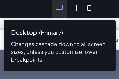
I have spent way too many hours tweaking Wix and Wix Studio websites to have learned the lesson of always setting up the content on the Primary breakpoint. Also known as the Desktop.
“But it's 2025, you should be mobile first.”
Yeah, you go ahead and cramp all the needed business info on mobile first in Wix Studio and then try to fix all the issues on Desktop, I’ll watch.
This step is often missed or neglected because the explanation is only visible when you hover over the breakpoint itself. As you can see, you can pick a lower breakpoint as a primary, but you need to customise it first.
For me, extracting unnecessary information is easier than deciding on what to add to a blank mobile screen.
I learned about this feature in Wix Studio when I was submitting my Jade Biju template. Yes, this is a shameless plug; a girl has to pay rent. 😅
Here is what it means. Apparently, if you don’t choose Min and Max for your font size on different breakpoints, there is a huge chance that your font will be too squished on smaller breakpoints.

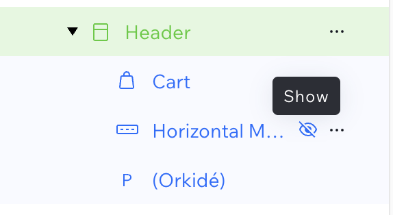
Everything works perfectly on the desktop, but once you hop on mobile, the menu is gone, the cart is shown to be outside of the grid, and you don’t know which element is the parent. This is the time to master the layers panel and the Hide/Show setting.
Not everything needs to be visible on certain breakpoints, so that’s when this comes in handy.
When you first jump into mobile to check if everything is well aligned, you might see something like this:
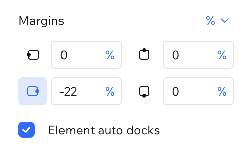
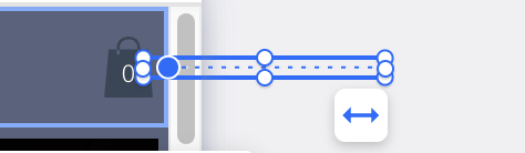
First, you would want to disable the auto dock by clicking on the active side, and then adjust the percentages based on where you want to see your element. This will help you position and fix your elements exactly where you want them.
Was this article helpful? Then you would love my Wix Foundations course! 🥳
---
Do you like what you read? Show your support by:
Sharing is caring!
P.S. If you want to be part of my journey, you can find me on Instagram @angelova.nikoleta.design and on LinkedIn (Nikoleta Angelova).
Struggling with design and development? Join me on my YouTube channel, where I explain web design, user experience and development practices and stream occasionally. 🤓
Availability Note:
I work with a maximum of 2 clients at a time to make sure each project and client gets my undivided attention. Hence, once I am fully booked I can only offer you the next available time slot. So make sure to send your request on time!
I will get back to you within 48 hours.


